1. Explain what happened to the man that was killed by the subway and how the photographer was able to take the photo.
The man who was killed by the subway because he was trying to settle a man who was harassing passengers. The man got angry angry and pushed him into the tracks. The photographer was near the scene and starting taking photographers, but claims he was using his flash to stop the train.
2. Why did the photographer say he took the photo?
He says he was using the flash on his camera to stop the train, and also says there was no way he could've helped the man anyways.
3. Do you think the photographer should have taken the photo?
I think it was very wrong to take the photograph, but it captures the hate among people today, and even the evidence of the photograph shows of what humans have become. First of all, an old man who was trying to do good gets pushed into train tracks, putting an end to his life. And then, instead of the photographer trying to help him, to him it is more important to capture a picture that will earn him publicity, rather than try to save a man's life.
4. Do you think the photographer did the best thing he could have done in this situation? Why or why not?
I don't think that he could've helped the man, because there was just not enough time and he could've not been strong enough, putting his own life in danger. But I think he could've brought someone's attention about, instead of just using flash to "warn" the train.
5. Do you agree or disagree with the decision to run the photo on the front page of the New York Post? Explain why or why not.
I have contradicting opinions about this question. Because the whole point of the New York Post is to bring news to people, and this is most definitely news. But it also seems inhumane to do this to the relatives of the man, because it magnifies the tragedy that has occurred in their life, creating it into a topic that is being discussed among people.
6. What is more important to a photojournalist, capturing images of life as it happens or stopping bad things from happening? Why or why not?
The purpose of a photojournalist is to capture the moments of life and to document them, yes it is VERY important to help people in need, but that is a different job.
7. Do you think it is ever ethically acceptable for a photographer to involve himself/herself in a situation that he or she photographs? Explain why or why not.
If they are helping the person they are photographing, it is of course acceptable to involve yourself in that situation, but I think you should also show the situation of the person before, so it is truly genuine.
8. Should photojournalists always avoid influencing events as they happen? Explain your answer.
If there is a way they can save a person's life, it's just morally wrong to not do anything about it. But if it is just a story that doesn't cause much harm to the environment or the photojournalist can't do much about it, I think it's best to stay out of the situation.
9. After reading the responses from the professional photographers, what stands out as the most appropriate response for a photographer to this situation.
The most appropriate response seems to be to at least attempt to help the man, because all of the responses claim to be "disgusted" by the photographer's actions and that he did nothing to help the man whose life is at stake.
Friday, December 18, 2015
Wednesday, December 9, 2015


Fashion Photography
1. List the changes that were made to the model's face in the computer. (Look carefully)
-lips are enlarged
-neck is made longer
-forehead is brought down
-neck is made skinnier
-eyes are made larger
-face is contoured, made smaller
2. List the changes that were made to the model's body in the computer. (Look carefully)
-shoulders are a bit raised
-back and stomach are made skinnier
-legs are made slimmer and longer
-calves are made skinnier and longer
-neck is raised and made longer
-body is airbrushed
3. List the changes that were made to the model in the computer. (Look carefully)
-butt and legs are made skinnier
-arms are made skinnier
-make waist smaller
-make bust larger
-head is made smaller
-hair is made longer and bigger
4. Is it ethically acceptable to change a person's appearance like these in a photo? Why or why not?
I don't think it's ethically acceptable to change a person's appearance this way. You are completely changing the person, and at the end they don't even look like themselves, so is it really a photograph of them? I think it's also very offensive to make such dramatic changes to a person's appearance because it's giving them the message that they themselves aren't good enough to be displayed.
5. Are there circumstances in which it would be more ethically wrong to do this type of manipulation?
In all situations this is very wrong, but I think if the person is not aware of the changes being made to their body is even more wrong. Because they did not agree to be changed is such a way, and in a way you are violating their body and rights.
6. What types of changes are OK, and what aren't?
The type of changes I consider to be ok are the one's that enhance the person's features, so at the end they still look like themselves but slightly airbrushed. What isn't okay is completely changing their features and turning them into a barbie doll as a final result.
7. Explain what you think the differences are between fashion photography and photojournalism.
Fashion photography is more glam, polished and formal. It takes you into the world of perfection and beauty, which isn't always real. Photojournalism is more about capturing raw moments in life. Things that you see everyday but making them more appealing to the eye.
8. What relationship does each type of photography have to reality, and how does this affect the ethical practice of each?
Fashion photography is on the far end of the spectrum of reality, while photojournalism is pretty close. It is very obvious that photojournalism is more ethically right than fashion photography. I think the reason for this is because fashion photography is targeted at larger amounts of viewers, and they want them to be drawn in towards their photographs, to do this they have to exceed reality. Photojournalism has a different type of focus and viewers that don't require such expectations.
9. Why do you think I am showing you these three videos?
Because you want us to be aware that in fashion photography, the image you are seeing wasn't originally captured by a camera, which makes you wonder a lot about the original form of the photograph.
10. Why are none of these videos about guys???
There are no videos of guys because girls are the ones in this generation that are expected to be pretty and perfect. Girls are usually the ones that always seem to be more concerned about their appearance, so when you put a pretty girl on a magazine cover, it both draws in the guys and the girls.
Magazines Part II
Early Magazine Covers
Early magazine covers were very different then what we view as magazine covers today. They were more similar to books and most did not consist of pictures/photos. In the mid-1700s the cover of a magazine would be the table of contents, and some would look like book covers displaying the title and publication data (and would something have an additional illustration). Other covers would have their first page of the magazine as the cover, a similar characteristic to newspapers.
The Poster Cover
The poster cover was mainly used from the 1890s to the 1960s and was just made up of an image, the title of the magazine and sometimes a small captions towards the bottom of the page. The photo issued would be eye-catching and between the years of 1890 to 1940 would sometimes not be related to the articles found in the magazine but resembling the mood or season of that time. Poster covers are a bold choice of covers because it brings the reader's attention to one specific subject.
Pictures Married to Type
When magazine covers first started having words on them, they were at first the names of the people that contributed to the magazine, but later evolved to having multiple cover lines on one magazine cover. They would play with fonts and colors but would not distract from the photograph itself. But in the late 1960s is when cover lines were being produced differently, catching the attention of the readers featuring stories about the diversity of people, stories people have never heard of before. In overall, cover lines created even more competition between magazines, each magazine wanting to be bigger and bolder.
In the Forest of Words
Forest of Words is when the cover lines of the magazine play and have a relationship with the cover photo. Almost all magazines these days have forest of words working to capture the consumer's attention. Because the producers of the magazine are aware of the layout of the magazine cover, the models are usually posed a certain way, so they can later be able to put words around the subject, playing well with the image itself.
Thursday, December 3, 2015
My Favorite Cover

This is my favorite cover because I love the way they played with photoshop and put "Person of the Year" making it look like a mustache resembling Hitler. They also incorporated the color scheme used in the war propaganda, making a very powerful statement of their opinions and feelings towards Putin. It seems ironic because when you think of "Person of the Year", you imagine a person who's doing good to our world and having a major impact. In this case, Putin is majority impacting all the countries around him, but in no good way at all.
Best Covers
1. Formal
2. Formal
3. Informal
4. Environmental
5. Formal
6. Informal
7. Informal
8. Informal
9. Informal
10. Environmental
11. Informal
12. Formal
13.Informal
14. Informal
15. Informal
16. Formal
17. Environmental
18. Informal/Environmental
Magazine Tips
1. Familiar recognition from issue to issue (that’s the brand).
2. Emotionally irresistible (that’s the image’s appeal).
3. If you can spare the time, go to the local drugstore or bookstore, and sneak your upcoming issue in among the other magazines on the racks.Does it hold its own or does it disappear?
4. If it is invisible like wallpaper, decide what element is worthy of becoming dominant by enlarging, by isolating, by more controlled color, by more clever wording.
5. Intellectually stimulating, interesting (that’s to promise benefits).
Tuesday, December 1, 2015


Monday, November 16, 2015
American Soldier- Photos Make The Story
Set 1 - at home - Image 1 to Image 3
Set 2 - basic training - Image 4 to Image 13
Set 3 - in Iraq - Image 14 to Image 27
Which set of images was the most powerful? Why?
The set of images that was the most powerful was when he was in Iraq because that's where all his handwork is being payed off and that's where the most danger is at. What is unique about this set of photographs is that it does not only focus on the man but also on his surroundings and captures both their and his emotions, and you are able to see how they both work together.
How do the images work together to tell a story?
The images work together to tell a story because it captures the man's transformation as he leaves his home and starts basic training. Not only is he changed physically, the photos are able to document his mental change of mind. The photos become even more enriched with emotion as he goes into Iraq because you can tell he has become more toughed by all the weapons and danger around him.
For the photos in which Ian is the main subject of the photos, in what tense are the verbs usually written?
The verbs are written in present tense.
How do the captions enhance the photographs?
The captions enhance the photographs because they make you feel as though you are right there while that moment is happening. It lets you know the background information of the photograph and goes into specific detail that usually would not be included in an article.
Summarize the story of Ian Fisher, based just on the captions.
Ian Fisher goes into the army right after graduating high school, but soon begins to feel out of place because of his injuries. While in training, he goes through physical and mental challenges because the program is designed to affect you that way. He is well liked and gets along well with the other troops and is successful in his missions. After serving in Iraq, he comes homes and marries his girlfriend, with the thought he is done serving.
Thursday, November 12, 2015
Self Portrait and Portraits Part I
Best Tips
1. Focus upon one body part -get close up
2. Play with backgrounds
3. Alter your perspective
Environmental Portraits


1. Focus upon one body part -get close up
2. Play with backgrounds
3. Alter your perspective
Environmental Portraits

I like this photograph because although the background isn't simple, it is still focused on the girl sitting on the bed very easily. I like how the subject is right in the middle and her surrounding easily convey a story. You can tell it is dark outside, and maybe even cold because she is covering herself with a blanket, and you may also assume she is a student because there is a notebook next to her.

I picked this photo because its very raw and emotional, although its just composed of a man sitting against a wall. The man's facial expression puts the whole photograph together and his clothes and surroundings just add to it. I think it can be hard to accomplish a photo like this, and a very good job was done here.
Self Portrait

I picked this photograph because its colors really stood out to me. I like how the hue of the photograph is the same, but the shades of blue are different. It's interesting how the subject is looking out somewhere, making you wonder what is outside the space of what the camera lens can capture.

This is a very interesting photograph because you don't know what the subject truly looks like, and end up looking at Marilyn Monroe from a magazine page. The photograph and the picture are perfectly lined up, when you look at it for the very first time, you almost think that is actually the woman.
Casual

I like this photograph because the woman is framed which I think always makes the picture more pleasing to look at. The colors of the photograph complement each other very well and again the photograph conveys a story and makes you wonder what the woman is looking out to.

I picked this photograph because it's very candid and you are able to see everything that the baby is doing and looking at. The colors and surroundings make you feel very happy which I think makes a great photo.
I have two ideas of what I want to shoot. I want to take a picture of one of my friends and either have it be a close up or a part of their body (not including their face). I would want to take these photographs in a lively place, such as downtown, sixth street or zilker. What I will do to make my photograph successful (if i do a close up of the face) is play with the eye contact and find a busy/interesting background and blur it out but you will still be able to make out what it is. If I decide to take pictures of their bodies, I would probably take it in portrait and have a lively background and try to incorporate depth in it.
Wednesday, November 11, 2015
Love and Loss Warm-up
1. What emotions did you feel as you worked your way through these images?
As I first started looking at the photographs, I knew about the story but still felt hope because they were so positive and raw. The photographs were shot at a close angle which gave a feeling of intimacy. But as I began to scroll down, some of the photos made me feel almost uncomfortable because it was such an invasion of privacy. I know that if I were in that situation, I wouldn't want anyone to see me in that sort of state. At the very end, I felt sad because reality had kicked in, and if you look at the very first photograph, the woman is beautiful and happy, and then when you get to one of the last ones, she's sick, looks older and worn out. It scares me because beauty and health don't last forever, and this is a prime example.
2. The photographer said this: "These photographs do not define us, but they are us." What do you think about this comment now that you have looked at the photos?
What I think this comment means is, yes these photographs are us, and you are looking into part of our lives. But there is so much more to a person, which you simply can't capture with a camera lense, and that includes, their past and their mind and thoughts they perceive.
3. Do you think you could shoot photos like this if you were in this situation?
I don't think I would be able to shoot photos like this becuase when there are negatives in my life, I try to stay away from them as much as possible. And capturing the negatives and having them to look back on is too much for me to handle. I might be able to take photos of the person when they are in a happy, but not at difficult times.
4. If you could write Angelo a letter, what would you say to him?
I would start out by saying that his work is beautiful and inspiring. It shows the challenges of life and what one person can handle. To me, the defintion of a great photograph is when you look at it, you are able to feel a strong emotion and see the story behind it. And it every single one of the photos, those elements were loudly present. I would also say that he is incredibly strong to be able to capture one of the toughest parts of his life, and then share it with the world.
Tuesday, November 3, 2015
Rules of Photography Part II

Rule of Thirds

Background

Depth
Framing

Viewpoint

Lines

Repetition

Balance

Cropping

Mergers
Wednesday, October 28, 2015
Abandoned Theme Parks
The theme park I would want to visit is Koka Family Land in Shiga Japan. The reason I would want to go there is because all the abounded rides have been affected by nature, which makes the "dead" amusement park seem a little more alive. It also has some of the more appealing rides if you compare it to the other abandoned theme parks. There's still some colors left (even though they are dull) it has a serene feeling to it and would photograph well. My favorite part is the ferris wheel because it is so big and it makes you wonder about the unexplored parts of it high up.


Five unusual places that I would like to photograph are a cemetary, abandoned asylum. abandoned schools, an abandoned prison and old houses.

I think it would be really interesting to photograph a cemetery because there's a lot of history behind it and even some stories (the gravestones). It also immediately gives off an eerie feeling just because of the fact it's a cemetery. There are also a lot of interesting angles you can take the photos at because of the placing of the gravestones. You can achieve great close up photographs but also landscape photos.
Getting to a cemetery wouldn't be a problem because I know of at least two in Austin and it would be easy to access and I wouldn't have to make an expense.
Africa
This was a very interesting article most of all because I have never heard of any photographer going to such extremes to get a perfect picture. What was the most impressive to me was his patience. To spend three weeks, just to capture one photograph is not something many people can do. Another concept that seemed extreme to me was that he actually got close to the animals to take the photographs. These animals are huge and some even dangerous, and risking your life to take the perfect shot shows his strong passion towards photography and the being of the animals. His photographs are like no other, when you look at them, they don't look real, they almost have a "majestic" look to them.

This is my favorite photo from his collection because it has an emotion behind it and even a story. The photograph is perfect because of the fact there are imperfections in it. The tilted tree is unique and captures you attention, and then the lion sitting under the tree alone gives off a lonesome emotion with makes the whole image more appealing.
The most noticeable rule in this photograph is framing because the tree is framing the lion. But there is also simplicity because the only objects in this photo are the lion and the tree.
Nick Brandt uses a Pentax 67II with two fixed lenses, this is an important part of his photography because he does not use a telephoto lens, meaning he himself has to get close to the animals to get the images he desires.
His reasons for taking these photos are to remember the animals of Africa before they are destroyed by the harsh forces of mankind.
Brandt's hope by taking these photographs is to spread awareness about the animals and their habitat and that we have to protect the creatures, because they are too beautiful and breath taking to lose.
"My images are unashamedly idyllic and romantic, a kind of enchanted Africa. They're my elegy to a world that is steadily, tragically vanishing."
Monday, October 26, 2015
Funny Captions

Sally Hansen is an 87 year old woman that does not enjoy the presence of people. She started her own clothing company last year that produces attire with the caption "I hate everyone", her business has been very successful!

Robert Johnson visits Las Vegas for his spring vacation every year and enjoys the company of exotic dancers. He donated $1000 last year to the "Exotic Dancers of the USA" campaign last year.
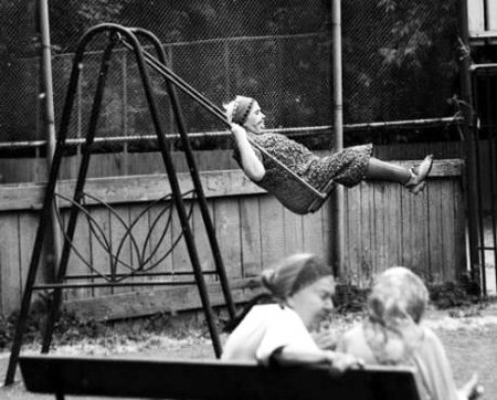
Lana Miller swings on the children's swing everyday in the afternoon. She started doing this after her doctor informed her she needed to receive more exercise.
Tuesday, October 20, 2015
Great Black and White Photographers Part III
1.) What first caught your eye while looking at your photographers photos? Is there something in particular about their photos that made you want to choose them? Post the images with your writing.
There are several the images stood out to me more than any of the others. The photographer with the man and the woman stood out among the photographs because there are two people in the photograph rather than it just focusing on one subject. What also makes this photograph great is the contrast, which is very important is black and white photography. It is darker along the edges and then slightly gets lighter towards the middle, where the subjects are. This leads toward the subject and makes it more noticeable. Then in the second photograph, of the man sitting at the desk, what made that photograph different than the others is he is sitting down and has other objects surrounding him, unlike all the typical portrait photos. There's a lot of character in that photo which ties in with emotion making the photograph more appealing and pleasing to look at and explore. Even with all the objects around him, the image maintains a good balance, the shelf balancing with the man. As in the other photo, it has a good contrast and makes things stand out. The man's face stands out against the background and then the lamp is lighter than the background, standing out and the contrast is balanced on both sides.
I see two people standing, still but full of emotion on their face. The man is taller than the woman, but not by a lot. The woman is beautiful and still youthful, the man has an important presence and is serious. They are both dressed nice and come from nice backgrounds. They are standing against a plain background with lights shining down on both of them.
I smell a clean dusty smell, the kind you smell after someone got done painting and the smell is still lingering in the air. It's crisp and pleasant and not too overwhelming. The smell has a cold feel to it, and when you inhale you feel refreshed and renewed.
I hear laughter and a deep comforting voice. The laughter coming from the woman and the voice coming from the man. There's distinct talking between the sounds of the clicking of the camera, and then a long silence. I hear feet shuffling as the people are trying to find their stance.
I taste the ripe taste of the wine the people have brought over. It feels dry as I continue to shoot the people. I take a bit of a small creamy cube of cheese and it melts like cotton candy. The flavor kicks in but it's still pleasant and a little tangy.
I feel happy and warm inside. The couple has a positive vibe which radiates all around them and infects everyone around. The woman makes you feel cared for and the man makes you feel important. When you mix them both in a closed room their personalities balance each other out, making you feel as though you are a young child, innocent and worthy.

I smell shaved wood and a hint of a rustic fire burning. It smells as though you have gone camping, but walls and a ceiling around your camping ground, blocking out the fresh air and cool breeze There is also a sweet generic smell in the air from a candle burning.
I hear silence and the thick sound of the ticking of the clock. I hear a loud continuing sound of a pen gliding against paper, and the shuffling of contracts are the man looks from something on his desk. I hear footsteps as the man walks over to the lamp and a "click" when he turns it on.
I taste black coffee which is slightly sweetened. It's hot against my tongue and burns as it goes down my throat. The taste is pure but bitter, with a smokey aftertaste.
I feel relaxed and not rushed. It seems as the world has stopped when you're in that room because the surroundings are so serene and quiet. It feels as though you can stay in that room for days, exploring the books that lay on the bookshelf and let your imagination wander sitting at the desk and putting down your imagination on a piece of paper.

What I would create to display the works of Yosuf Karsh would be a website including his best photographs and then the story behind the photograph. Meaning I would research the person he photographed and write a little biography on them. I would also analyze the photo and explain what elements make the photograph like no other.
Friday, October 16, 2015
Mural Project
1. What theme that we could take here at school could we do a series of these panels to place around the school?
A theme that we could create here at school is taking pictures of fine arts classes such as band, orchestra, dance, art and choir. I think this would be better than just the average classroom photos because you will be able to see a larger story behind the photograph and also embodying more emotion.
2. Should we use phones only, or should we open it up to our regular cameras for those people that don't have camera phones?
I think we should be able to use regular cameras because you can control how the photograph comes out a lot better on a regular camera rather than a phone camera.
3. Where would you want to put the mural on campus?
I would want to put the mural on the walls outside of the library because that is the academic building and it will be interesting to bring in the world of fine arts into an academic setting.
Saturday, October 10, 2015
Academic Shoot Reflection and Critique
1. What challenges did you encounter while trying to get the photos following the rules I set out for you?
2. What technical aspects of photography or the assignment in general (focus, framing, holding the camera, etc.) did you find yourself thinking about the most? Provide a specific example of what you did to do this correctly.
I thought about focus a lot because to me the most pleasing photographs are when your subuject is in great focus and then the background is a little blurred out. To get a good focus I would hold the button for a while and then shoot. I also sometimes focused the camera manually.
3. If you could do the assignment again, what would you do differently now that you know some basic rules of photography?
4. What things would you do the same?
5. When you go out with your next set of prompts, which rule do you think will be the easiest to achieve?
6. Which rule do you think will be the hardest to capture?
7. What rule are you still not totally clear on and what can you do to figure out what that rule is?
I am clear about all the rules.
The blog I critiqued:
Katrina's Blog
I really liked her photos because all of them are telling a story and have emotion. My favorite is the black and white photograph because I like how all the boys are leading to the subject point and not distracting from it. On the last photograph I think if she were to crop out the clock on the right side it would be better because it's a little distracting.
Thursday, October 8, 2015
Academic Post Shoot Reflection

2. What is the subject (be very very specific)?
My subject is the girl with brown hair on the left side of the photograph. If we are being very, very specific then the subject are her hands, because that is where the "action" is happening.
3. Is it clear to people looking at your photos what the subject is?
4. If you can't very clearly see what the subject is, what could you have done differently?
You can see the subject clearly.

The compisition rule I followed in this photograph is balance because the two boys in the front of the photograph are balancing each other out, and then the boy in the back is balanced with the people in the background.
2. What is the subject (be very very specific)?
The subject of the photograph is the boy in the front kneeling over the boy laying on the ground.
3. Is it clear to people looking at your photos what the subject is?
I don't think it is completly clear who the subject is in this photo, and different people may see it different ways.
4. If you can't very clearly see what the subject is, what could you have done differently?
To make the subject more clear I could've blurred the background and really focused on the two boys in the front. I also could've shot at a differnt angle or positioned him in a more noticable way.

The compiition rule that I followed was lines because if you look towards the bottom of the picture there is a line and then the people standing are forming a line.
2. What is the subject (be very very specific)?
The subject is the teacher (the man in the black).
3. Is it clear to people looking at your photos what the subject is?
I think it is clear who my subject is because he is separated from the rest of the crowd, but I could've done a better of job of making it even more obvious.
4. If you can't very clearly see what the subject is, what could you have done differently?
I could have positioned him better (I think using the rule of thirds could really improve this). Maybe even incorporate simplicity not having shot so many people in one photograph so he could stand out more.
Friday, October 2, 2015
Aperture, Shutter Speed and ISO
F2.8 Aperture

F16 Aperture

1. What part of the body should we closely relate aperture?
The human eye, and specifically the iris, because it controls the amount of light let into the eye.
3. In your own words tell me how aperture impacts Depth of Field?
Aperture impacts depth of field because the lower the aperture, the more depth of field you are going to get because it blurs out the background only focusing on you subject point. But if your aperture is high, both the background and the subject point will be focused.
Low Shutter Speed

High Shutter Speed

a.) a booth in the middle of the yard near the Tree
b.) a food booth outside under one of the big red awnings
Low Shutter Speed
c.) the Stars performance inside the gym
d.) students dancing near the center of the courtyard
e.) people streaming in from the front doors
f.) the basketball booth where students are shooting basketballs at a hoop
High Shutter Speed
Towards the end when there is no sun and has gotten dark enough that you can't see from one end of the courtyard to the other.
a.) a booth in the middle of the yard near the Tree
High Shutter Speed
b.) a food booth outside under one of the big red awnings
High Shutter Speed
c.) the Stars performance inside the gym
High Shutter Speed
d.) students dancing near the center of the courtyard
High Shutter Speed
e.) people streaming in from the front doors
High Shutter Speed
f.) the basketball booth where students are shooting basketballs at a hoop
High Shutter Speed
Three settings regarding the shutter speed
"Aperture Priority" - you are setting the aperture yourself, while the camera is setting the shutter speed for you
"Shutter Priority" - you are setting the shutter speed, while the camera is setting the aperture for you
"Manual" - you are setting both the aperture and the shutter speed on your own
ISO 3200

ISO 200

1. What are the advantages of shoot at a higher ISO at a sporting event like basketball or a night football game?
The advantages are that when you use a high ISO you can get fast movement shots and still have them to be clear. When you are shooting at night a high ISO is important because it still captures a clear image in a low light setting.
2. What suggestions did the author make about using a low ISO?
You should use low ISO when there is already a lot of light present, so you can get a clear photograph.
3. What suggestions did the author make about using a high ISO?
You should increase your ISO when there is not enough light for the camera to be able to take the photo quickly.
DSLR Camera
Aperture Settings:
2.4, 4, 5.6, 8 , 11, 16 , 22
Shutter Speed:
1 second, 1/60 second, 1/4000 second
ISO:
100, 200, 400, 800, 1600, 3200, 6400, 12800, 25600
Subscribe to:
Comments (Atom)