(Photo of my choice)
I like this photo and it is one of my favorites out of all the ones I took, mostly because it's a really simple and generic photo, and for me "simple is better". I think it's a good photo, not entirely original but the photography elements are good. The lighting is good and even, there are some lines crossing, making an intersection in the photo making it more interesting then just having an even surface. But I wish that my photograph wasn't so centered because that makes it boring to look at. I also wish there was a pop of color somewhere.
(Photo with my teammate in it)
(Photo of a living thing)
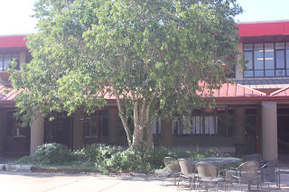
I like this photo because it has a really simple color scheme (red, green, and beige) and two of the colors (red and green) are complementary colors, so the green really pops. If you look at the photo, you notice the big tree in the middle, but what makes this photo unique to me is there is also something going on, on the right, making the photograph more interesting. But there are some things I don't like about this photograph is the lighting is uneven, making the colors look different in at different part. The lighting is brighter at the very top of the tree (more to the left side) and then the the side walk is brighter on the left side than right.
(Photo that reminds me of the first day of school)


No comments:
Post a Comment